
Read First: you do not have the ability to edit any aspects of widgets, which includes widget titles, content, placement and design, so you must reach out to the uConnect support team here to make any adjustments to your widget settings.
Overview
A widget is a section on your uConnect platform that displays content. Each widget has its own settings that determine which content gets pulled in from a certain source, such as only featuring resources tagged to a certain content category like Resume Templates or only featuring events tagged to a certain community page.
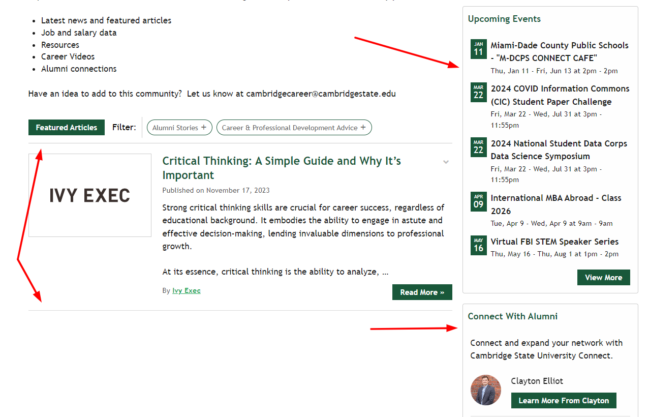
Most of the time, you can tell if something is a widget on a page if it appears to be its own distinct section with definitive lines and borders around the content. Here is an example below; note the borders around the distinct widgets, which in this case include a Blogs widget, Events widget, and People widget:
Tip: Widgets can only feature one type of content at once, meaning a Blogs widget can ONLY feature blogs articles - no other content types.
What can be modified about widgets:
Layout:
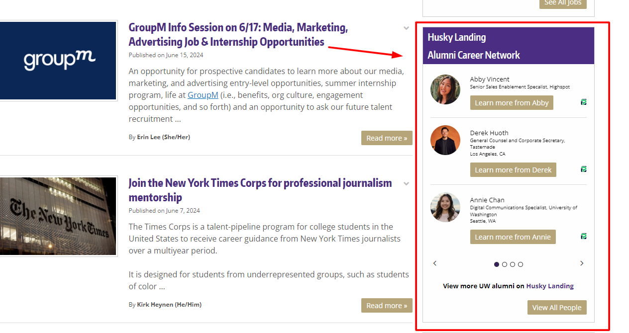
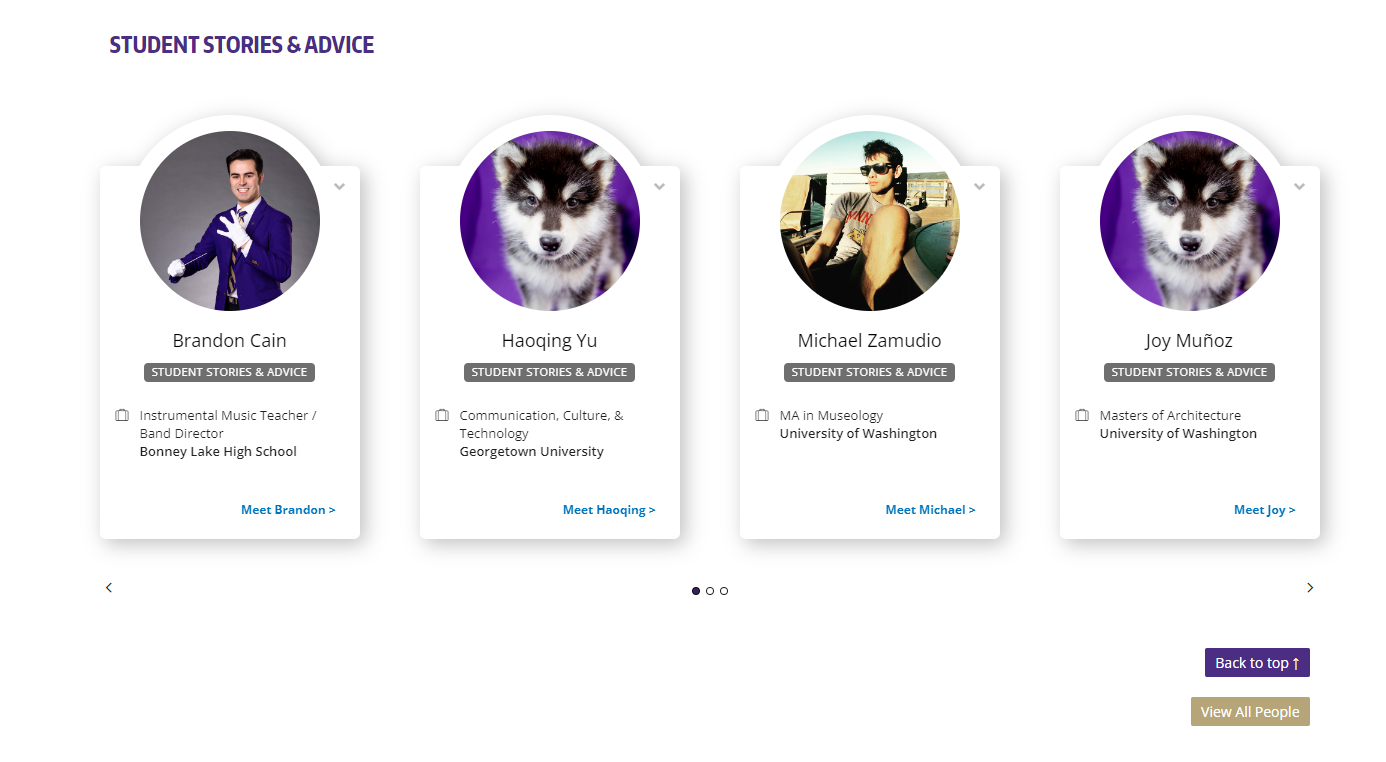
Widgets also have two layout options: 1) vertical, or 2) horizontal, so consider these options when designing your pages. For example, below is an example of a People widget in both the vertical layout and horizontal layout:
Vertical Layout
Horizontal Layout
Troubleshooting Tip: If you are tagging content to a certain page but it is NOT appearing, it may be that 1) there is not a widget set up on your page yet, or 2) the tags you are using for your content do not match the current widget settings. Either way, please reach out to us via our widget form!
Titles, Header and Footer Text:
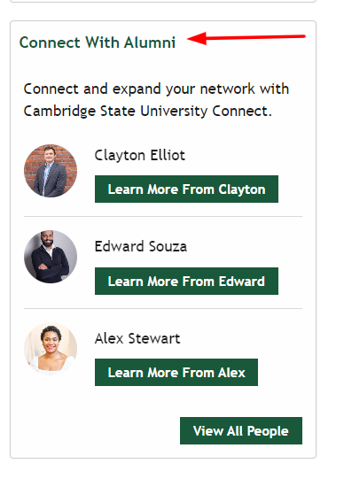
We can modify the title of the widget to whatever you'd like, such as this People widget having the title "Connect with Alumni"
You can also request for the support team to include header or footer text within the widget too that would sit either right underneath the widget title or right above the CTA button. See screenshot below:
Placement:
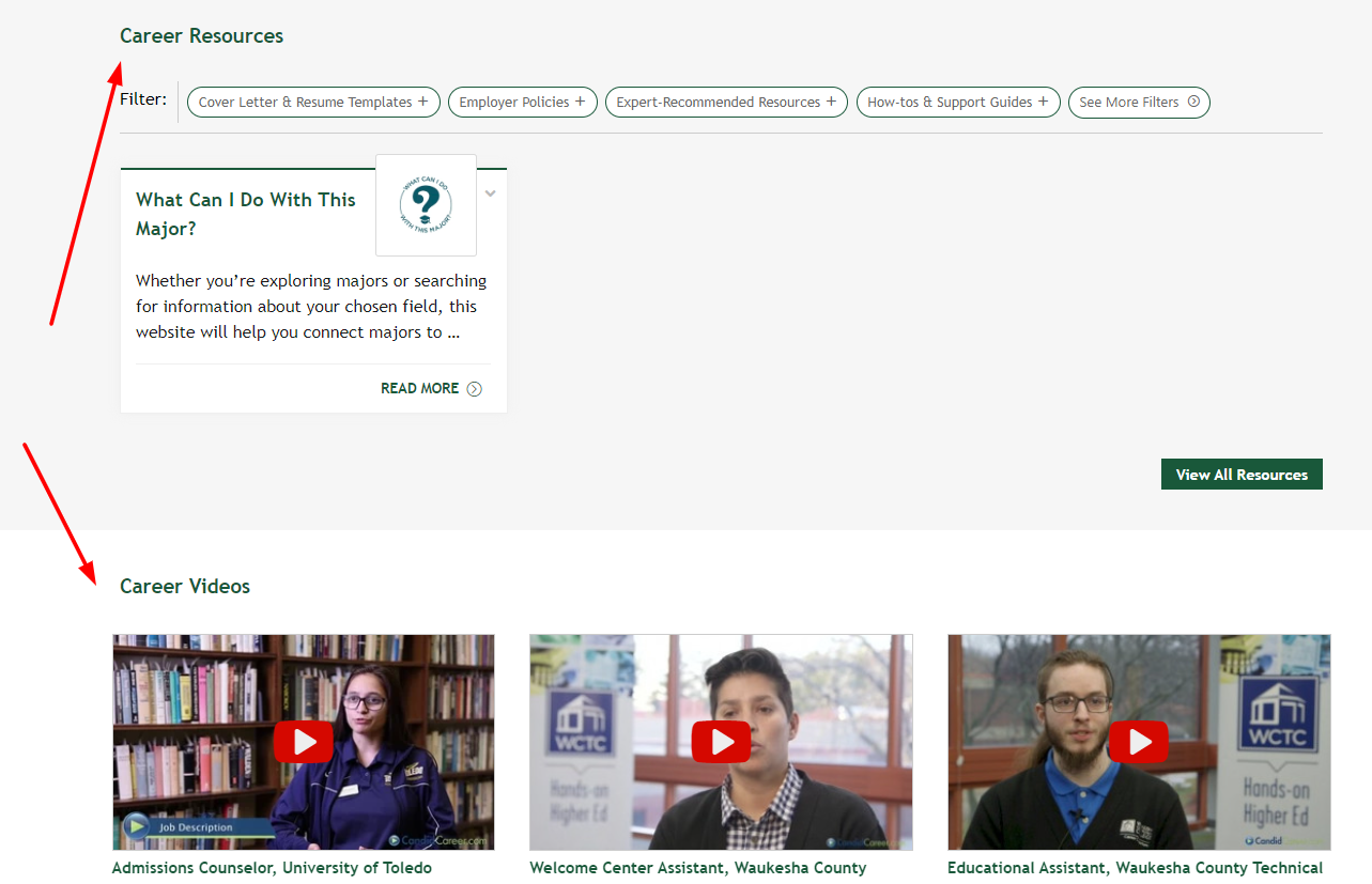
You may want to move widgets around on your page and change the order and we are able to move widgets to a different placement on a page or to another page completely. For example, we could switch the order of the Resources widget by placing the Videos widget above it:
Call-To-Action Buttons:
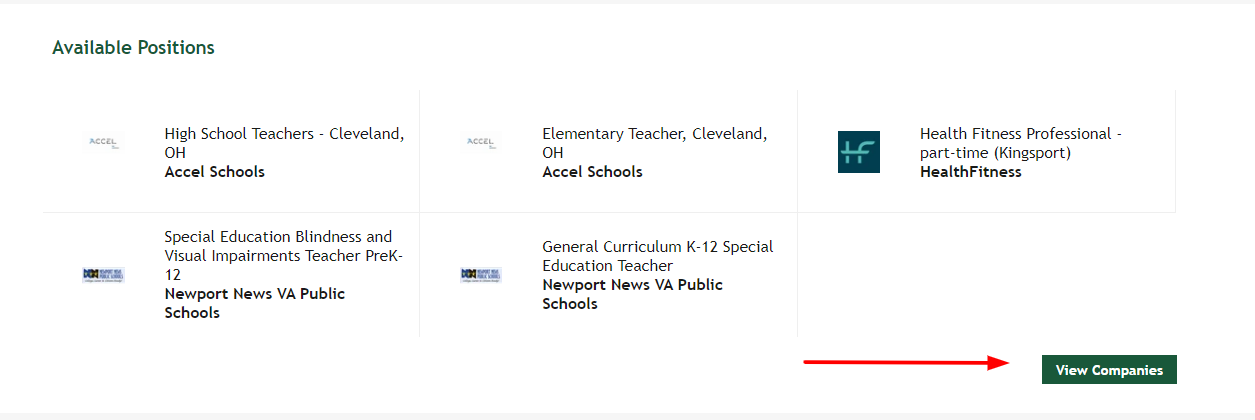
We can edit the text of the CTA buttons that are in the bottom-right corner of each widget:
Use Widget IDs to locate Widgets
Widget IDs are the unique identifiers for each widget - think of it like their full name, such as John Smith. They all follow a similar format in most cases, so let's understand the anatomy of a widget ID:
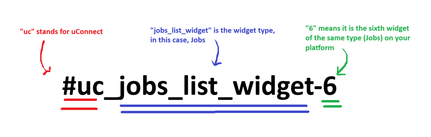
The widget ID will begin with a hashtag, followed by "uc" which stands for uConnect, followed by the type of widget, and then the number, which indicates how many of this widget type you already have.
You use this ID to create a hero community menu to anchor to the specific widgets on a page. This is the same navigation menu functionality covered by the Menu widget below.
Staff and Admin users have the ability to view widget IDs, when logged into their platform. This allows them to easily copy that widget ID, so that they can update their hero navigation menus without the support of the Support Team.

For a Staff or Admin user to take advantage of this feature, they must first be logged into their platform. Then, in the left corner of your platform, they will see a checkbox that says ‘Show Widget IDs?’ When this box is checked, they will then see a widget ID over every widget. A client can then easily hover over that widget ID and click ‘Copy’ to copy that ID. That ID can then be used to update their hero navigation.
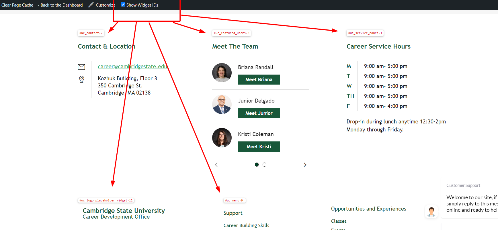
The widget ID view can also be easily toggled off again at any point, as long as the user is logged in.
Types of Widgets
There's a widget for nearly every kind of content and functionality on your uConnect platform. Below, they're grouped the same way our own widget library organizes them — Content Types, Highlighted Information, Site Interface, and Modules — with a live, interactive example linked for each one so you can see exactly how it behaves before requesting it.
Content Type Widgets
These widgets each pull in one type of content from your Publish tab (blogs, events, jobs, etc.) based on the tags and filters you choose.
Blogs widget
Works well in either the sidebar or full-width areas; images only display in the full-width layout, and the widget adjusts automatically based on where it's placed. Blogs are also one of the few content types you can add directly to a Community page yourself, by turning on that page's "Dynamic Feed" setting — though that only activates a vertical Blogs widget, not a horizontal one. Learn more about Dynamic Feed.
Key settings: number of posts (defaults to 5), category, communities, author, and CTA button text/link.
→ See a live example of the Blogs widget
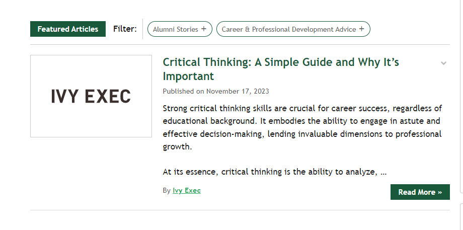
Classes widget
Full-width only. Displays as 3 or 4 tiles across the screen. You can manually publish Classes, but partners often integrate a learning platform like LinkedIn Learning so classes populate automatically.
Key settings: order by (menu order, date added, title), class category, communities.
→ See a live example of the Classes widget
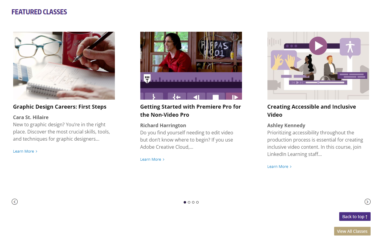
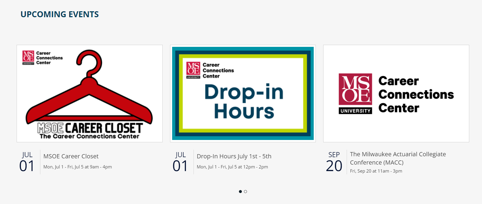
Events widget
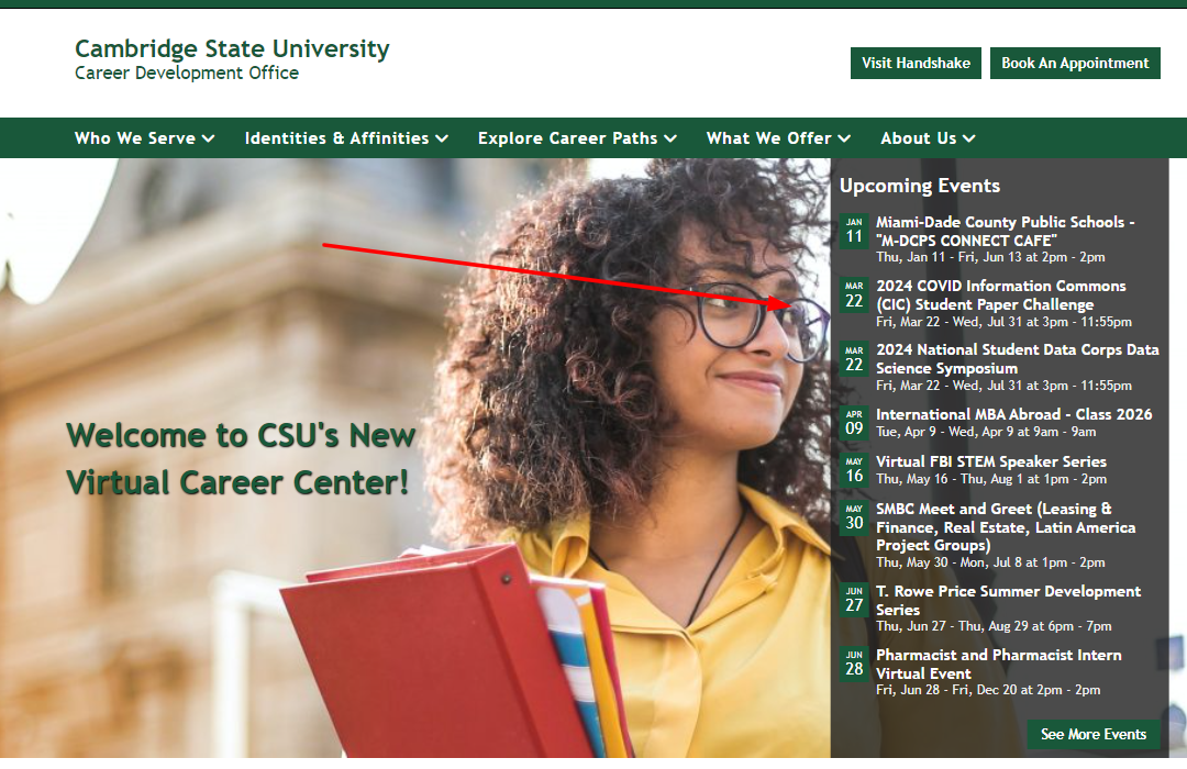
Works in the sidebar or full-width; images only show in the full-width layout. There are actually three ways an Events widget can appear: standard vertical, horizontal, or overlaying your homepage banner (toggled on in Customize — see Add a Front Page Banner). You can manually publish Events, or sync them automatically from a Career Management System like Handshake, Symplicity, or 12Twenty.
Key settings: max number of items (1–20), "Show featured images" (switches the layout to tiles), "Exclude multi-day events," event calendar, event category, communities.
→ See a live example of the Events widget
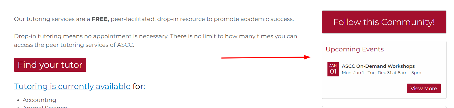
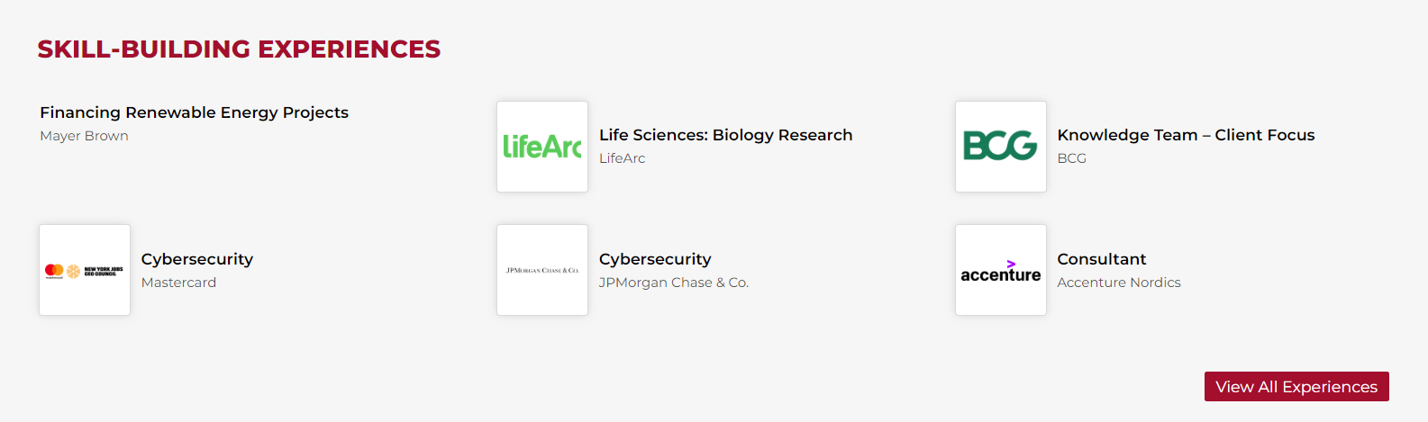
Experiences widget
Works in the sidebar or full-width. Used to showcase experiential opportunities — study abroad, volunteering, fellowships, and similar. You can manually publish Experiences, or pull from our External Content Library, which includes Forage experiences.
Key settings: number of items (multiples of 3, from 3–24), order by, experience category, shared community.
→ See a live example of the Experiences widget
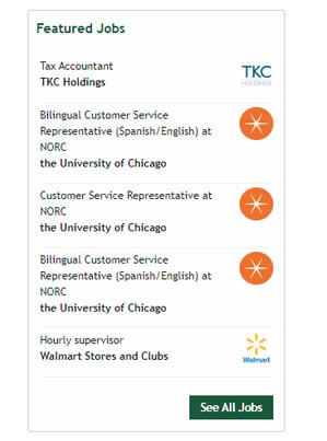
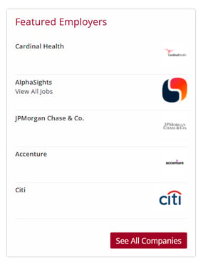
Jobs & Employers widget
Works in the sidebar, limited-width, or full-width areas. This is a single widget with a View toggle between "Employers" and "Jobs" — and the available settings change depending on which view is selected. In Employers view, you can choose to show only employers with active jobs, or only sponsors. In Jobs view, you can sort by date published or by soonest expiration. You can manually publish jobs/employers, or sync from Handshake, Symplicity, or 12Twenty.
→ See a live example of the Jobs & Employers widget
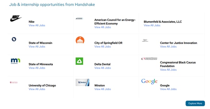
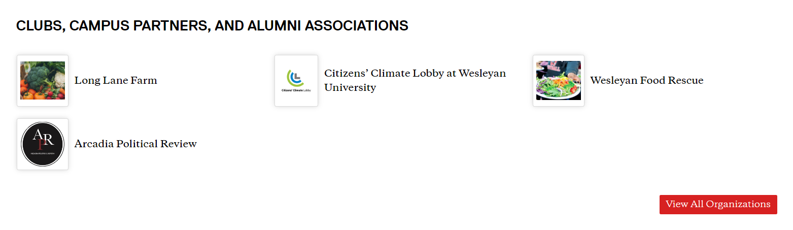
Organizations widget
Works in the sidebar or full-width. Used to feature both on-campus/student organizations and professional associations. You can manually publish Organizations, or sync from a tool like CampusGroups or Anthology.
Key settings: number of items (multiples of 3, from 3–24), order by, organization category, community.
→ See a live example of the Organizations widget
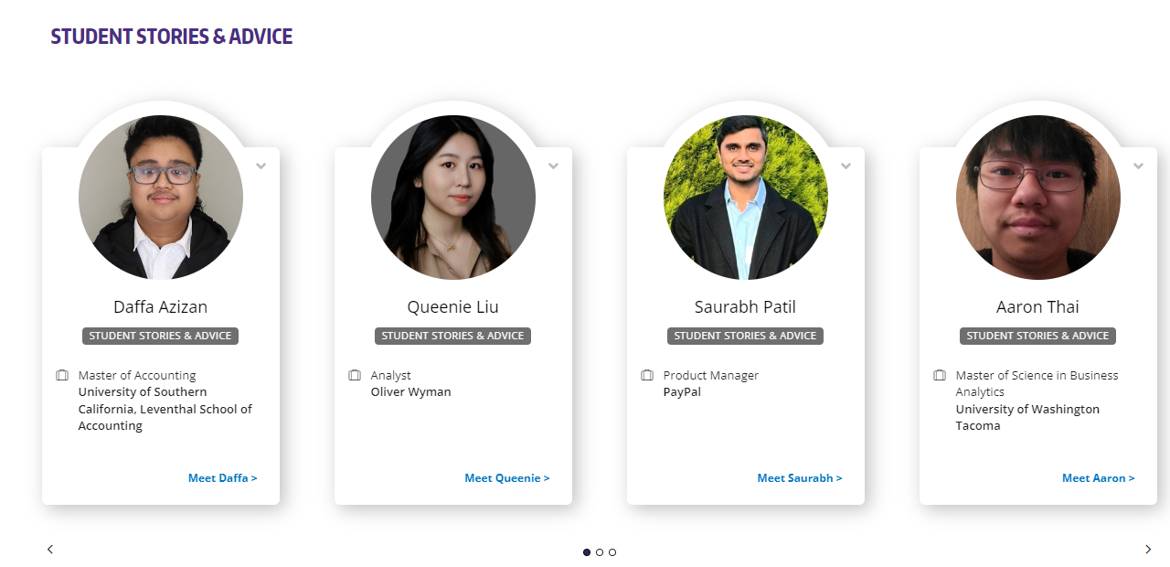
People widget
Works in the sidebar or full-width, in vertical or horizontal layout. Used to feature people profiles — students, alumni, employers, mentors, and more. You can manually publish People, but partners often integrate a mentoring platform (PeopleGrove, Graduway, Firsthand) so profiles populate automatically. One detail worth knowing: each profile's CTA button links to that person's published uConnect page if they have one — otherwise, it links out to their external profile instead.
→ See a live example of the People widget
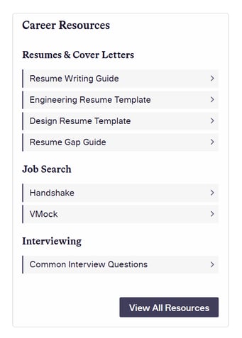
Resources Links widget
Works in the sidebar or full-width. This is the simple, text-link version of the Resources widget — resources are grouped under their Resource Category as a clean linked list. Title defaults to "Career Resources."
Key settings: order by, resource category (is/is not), communities, and options to hide resources with no community tag or no category.
→ See a live example of the Resources Links widget
Resources Tiles widget
Full-width only — this is a different widget than Resources Links above, not just a different layout of the same one. Resources Tiles displays as a browsable, filterable grid: visitors can filter directly on the page by Resource Category, Affinity, or People type. This is the widget to request if you want students to be able to self-filter resources rather than just scroll a list.
Key settings: number of items (multiples of 3, from 3–15), filters (community tabs above the tiles, or "None" to hide the filter bar), resource category, communities.
→ See a live example of the Resources Tiles widget
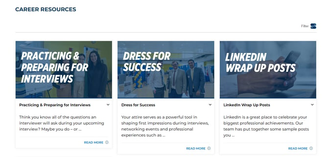
Note: Resources Links and Resources Tiles are two distinct widgets with different capabilities and placement support — Resources Tiles is full-width only and adds on-page filtering; Resources Links works in the sidebar too but is a plain linked list.
Scrolling Employers widget
Full-width only; commonly used to display sponsor logos. If there aren't enough employers to fill the widget area, the logos display statically instead of scrolling — you'll want at least 5 employers marked as sponsors to trigger the marquee effect. The widget also respects accessibility preferences: if a visitor's browser signals "prefers reduced motion," the animation is skipped in favor of a manual scrollbar. Learn more about featuring employers here.
→ See a live example of the Scrolling Employers widget

Videos widget
Works in the sidebar or full-width, always in a carousel layout. You can manually publish Videos, or pull from our external content video library.
Key settings: number of items (multiples of 3, from 3–12), order by, video category, shared community.
→ See a live example of the Videos widget

Highlighted Information Widgets
These widgets aren't tied to a Publish-tab content type — they're used to call out specific information, media, or messaging anywhere on your platform.
Contact widget
Most commonly used in the Bottom Widget Area or a footer widget area, though it's also supported in the sidebar. Can pull automatically from your site-wide Customize > Contact & Social settings, or be set manually per-widget. Note: social icons are configured separately under Customize > Contact & Social, not within this widget.
→ See a live example of the Contact widget
Custom HTML widget
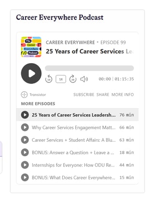
Can be added to virtually any widget area — sidebar, full-width, limited width, header, top ribbon, or footer. Supports advanced formatting and embedded content, including iframes (for example, embedding a podcast player). A title is optional, and often not advisable in certain placements like the Top Ribbon. If you're looking for more built-in styling flexibility without hand-coding, the Multi-Column Banner widget (below) is usually the better fit.
→ See a live example of the Custom HTML widget
Employer/Alumni Panel widget
Full-width only. A two-column panel designed to highlight the relationship between employers and alumni — though only one of the two columns is actually required. A single background image spans both columns, and the second column automatically receives a darker overlay for readability.
→ See a live example of the Employer/Alumni Panel widget

Featured Users widget
Works in the sidebar, limited width, or full-width. Used to show the right team member(s) to contact for a specific community — user lists can be automatic or hand-picked.
Note: This is a different widget than the People widget above. Featured Users pulls from actual users on your uConnect site (staff, admins, student staff, community experts) — People pulls from mentors, alumni, or employers, often via a third-party integration. If a customer asks for "the widget with our advisors," this is usually the one they mean.
Key settings: which users to show (all, staff page, current community, or hand-picked), role, CTA style (Meet [Name], Schedule an Appointment, Send an Email, Custom, and more), and whether to display each person's job title.
→ See a live example of the Featured Users widget
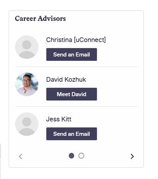
Image widget
Can be added to any widget area. Once uploaded, an image can be linked, given alt text, and set to a specific display size — this works more predictably for raster formats like JPG or PNG than for SVGs.
→ See a live example of the Image widget
Multi-Column Banner widget
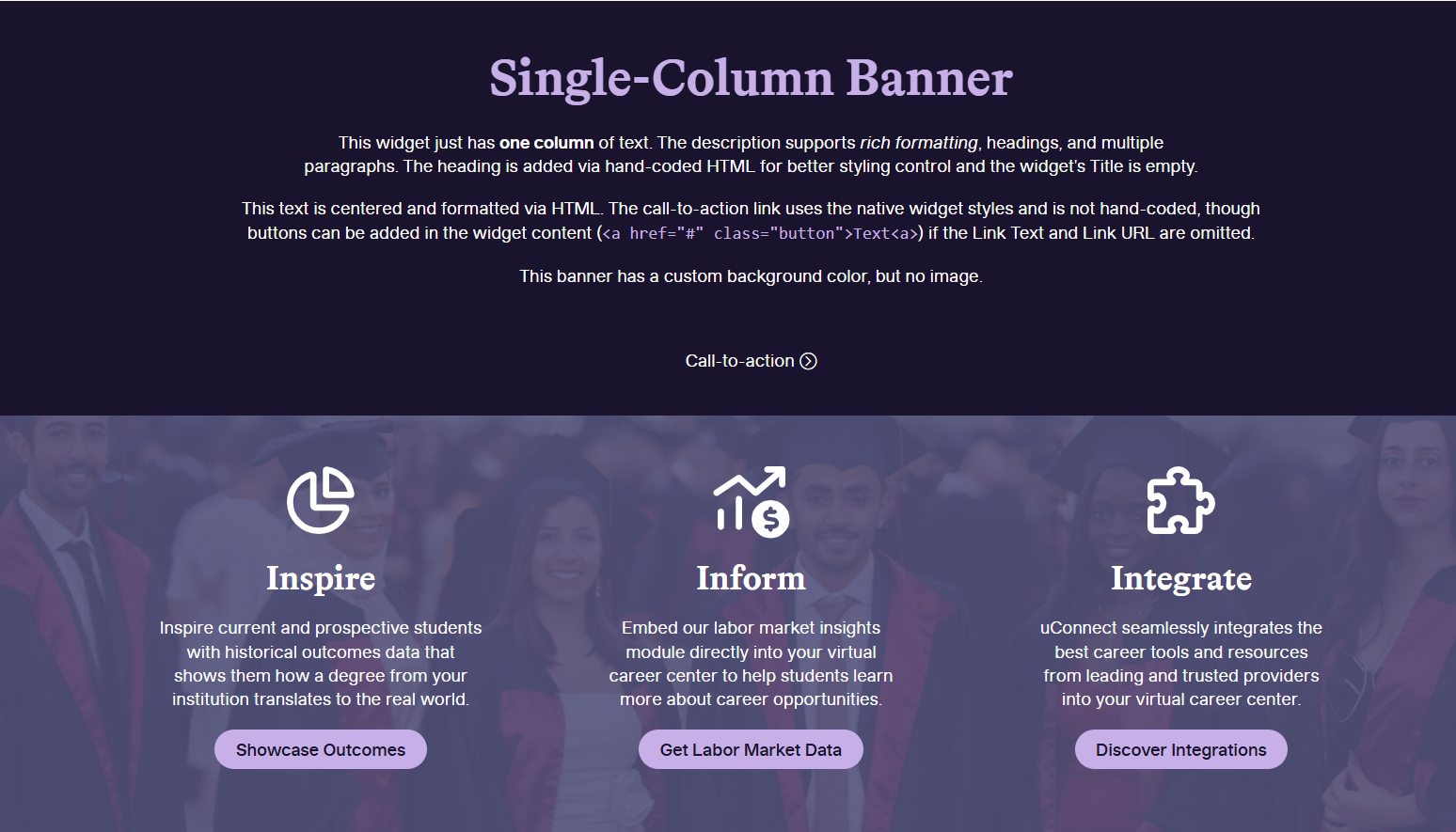
Full-width only. A flexible banner that supports one or more rich-text columns, each of which can include images and additional HTML formatting. Supports a background image (with a separate mobile version, if needed), background color, text color, and a single CTA button displayed beneath all columns. This is the widget to reach for when a customer wants more visual control than the Text or Custom HTML widgets offer, without hand-coding everything themselves.
→ See a live example of the Multi-Column Banner widget
Service Hours widget
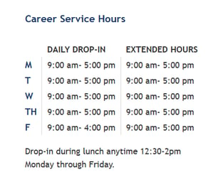
Most commonly used in the Bottom Widget Area or a footer area; also supports limited width. Hours pull automatically from Customize > Contact & Social, or can be entered manually. Supports a secondary "extended hours" set with its own label, plus free-text hours description.
→ See a live example of the Service Hours widget
Text widget
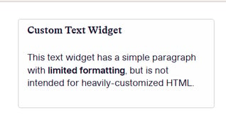
Can be added to any widget area. Intended for plain text with only the most basic formatting — bold, italic, or a simple link. Not meant for heavily customized HTML; use the Multi-Column Banner widget instead if you need more design flexibility.
→ See a live example of the Text widget
Site Interface Widgets
These widgets control navigation and site "chrome" — menus, buttons, logos, search, and social links — rather than content.
Button widget
Works in the sidebar, header, top ribbon, or footer. Requires both a title (the button text) and a link. Styling is controlled by your theme or Customizer settings and can vary by placement — sidebar buttons, for example, default to a larger font size, and are often used to nudge people toward customizing their alert preferences.
→ See a live example of the Button widget
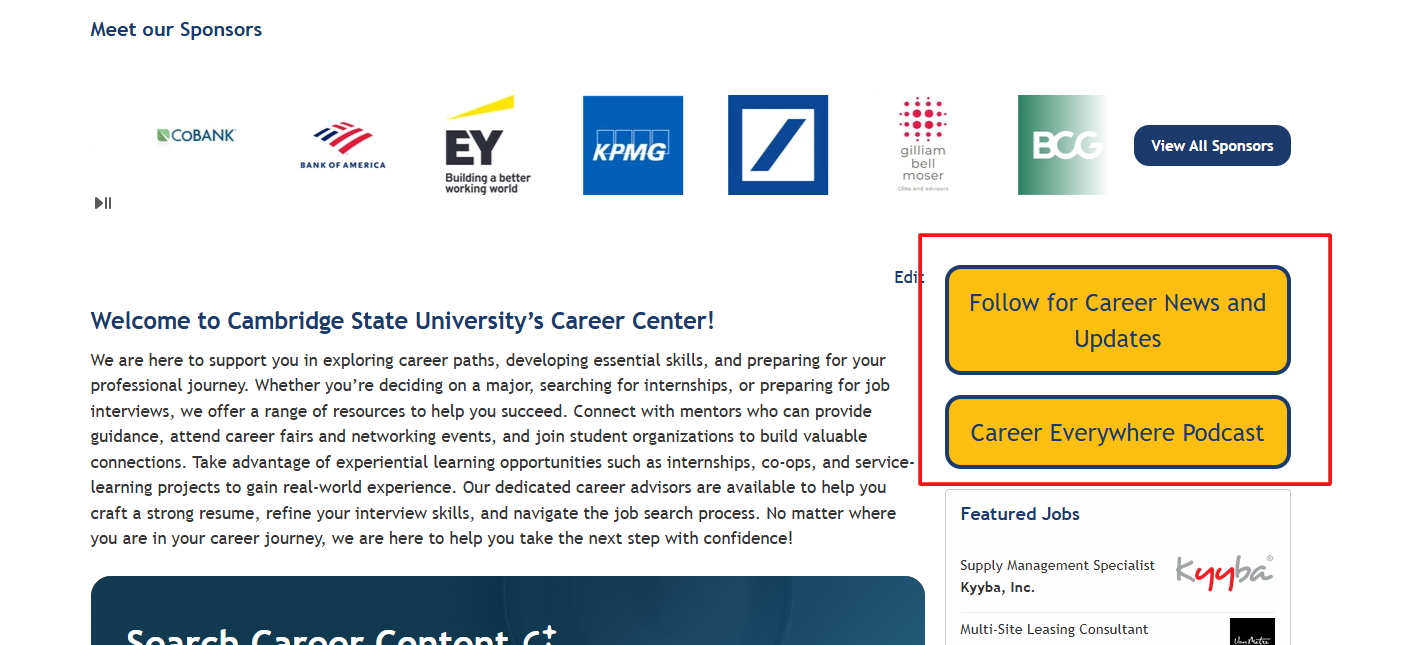
Fun fact: you can also add your own buttons to page content directly using the Block Editor, separate from this widget but you cannot add them into the sidebar area.
Logo Placeholder widget
Works in the header, top ribbon, or footer. This one has no widget-level settings at all — the logo image, link, alt text, logotype, tagline, and layout all come from the Customizer, and are chosen per widget area.
→ See a live example of the Logo Placeholder widget
Menu widget
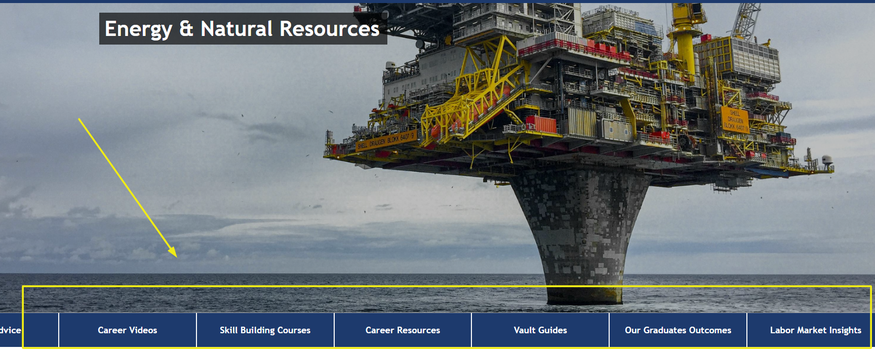
This is the widget behind the hero community navigation menus referenced in the Widget IDs section above. It works in the sidebar, full-width, header, top ribbon, or footer — though the supported navigation style depends heavily on where it's placed (for example, "Hero" and "Customizable Hero" styles are only intended for the Middle or Bottom Widget Areas, while "Vertical" or "Button" styles suit the sidebar). Sticky menu behavior — where the menu stays pinned to the top of the page as visitors scroll — is available by request from the uConnect support team.
→ See a live example of the Menu widget
Search widget
Works best in the Top Ribbon, but is also supported in the sidebar. Can optionally be swapped for an AI Search button launcher instead, via Customize > Settings > AI Search — when that option is enabled, the widget's own settings no longer apply.
→ See a live example of the Search widget

Social Icons widget
Works in the header, top ribbon, or footer. Has no configurable settings of its own — the social networks it displays are set under Customize > Contact & Social, and styling comes entirely from your theme/Customizer.
→ See a live example of the Social Icons widget

Module Widgets
These widgets are powered by add-on modules and may only be available if that module is activated on your platform.
Labor Market Insights (LMI) widget
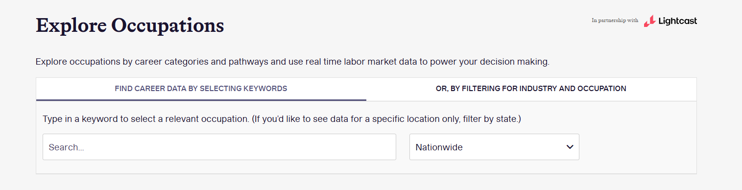
Full-width only, and limited to one per page. Requires LMI to be activated on your platform. Can be pre-filtered to a specific occupation or industry — great for career- or industry-focused pages. Displays data across several tabs: Employment Trends, Top Employers, Education Levels, Annual Earnings, Technical Skills, Core Competencies, and Job Titles.
→ See a live example of the Labor Market Insights widget
Outcomes Data Visualization (ODV) widget
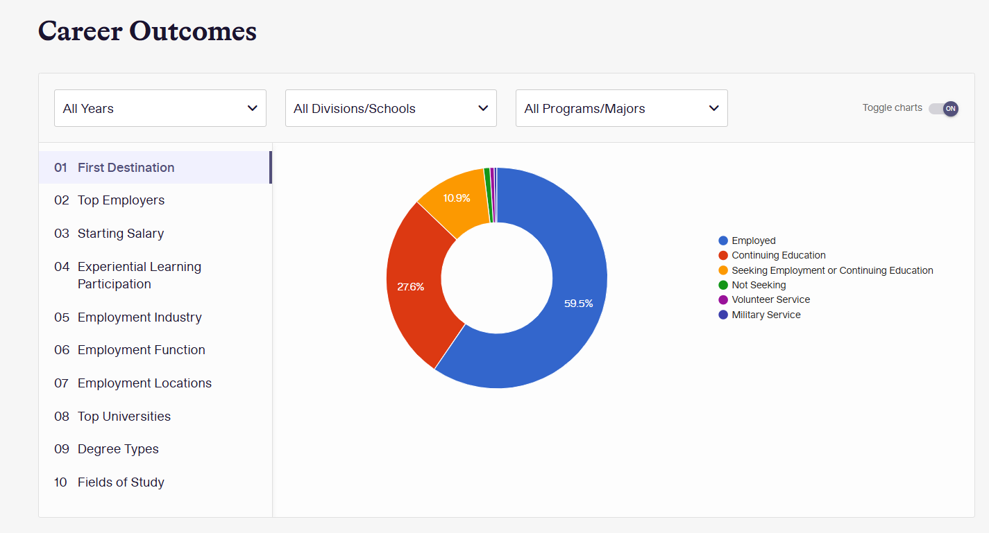
Full-width only, and limited to one per page. Requires a paid ODV module. Can be pre-filtered by academic major/program — great for college, department, or career-focused pages. Displays data across tabs including First Destination, Top Employers, Starting Salary, Experiential Learning Participation, Employment Industry/Function/Location, Top Universities, Degree Types, and Fields of Study.
→ See a live example of the Outcomes Data Visualization widget
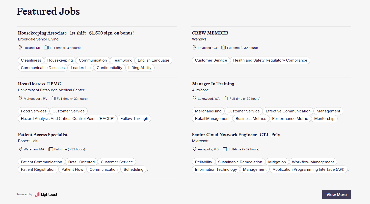
Job Search (via Lightcast) widget
Works in the sidebar or full-width.
Note: These are not the jobs published or synced within your own uConnect platform — that's the Jobs & Employers widget above. This widget instead pulls in live postings from Lightcast's broader labor market job index, which is useful for showing students a wider pool of openings beyond what your own employer partners have posted.
Key settings: number of posts (defaults to 6), and filter by either Career Clusters (Categories) or Pathways (Subcategories) — not both at once.
→ See a live example of the Job Search widget
Not sure which widget fits what you're picturing? Browse the full interactive library at widgets.demo.uconnectlabs.com, then submit a widget request and let us know which one you'd like added or updated.