Learn about the different blocks that can be added to your text editor within pages, resources, blogs, and Communities
"Blocks," which are used to add a variety of different sections to help organize important descriptive text and information for your users in a visually appealing way, can be added to a page, resource, blog, or Community.
If you’re curious about the value of the block feature and are hoping to learn more about what blocks are, feel free to check out our support article here.
To include a new block on a resource, page, or blog, first navigate to either Publish>Pages, Publish>Resources, or Publish>Blogs, and click the ‘+’ sign from the description section, as shown below:

From here, you’ll be able to select any of the below blocks in the 'Block Types' section of this article, depending on what type of information you’re hoping to present:
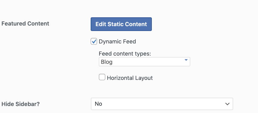
If you'd like to add a block to a Community, the steps are similar to the above. You'll first navigate to Manage>Communities, and select the Community you'd like to add a new block to. From here, you can click the 'Edit Static Content' button as shown below.

Once clicked, you'll be brought to an editor page, where like blogs, resources, and pages, you can click the blue '+' sign to begin entering a new block. To view some of our block options, please see the list to follow.
Block Types:
*Paragraph: Allows you to add a new paragraph of text to easily organize content into sections
*Heading: Helps to break up your paragraph text into different subsections, making it easy for front end users to locate specific topics more quickly
List: Provides the option to add bullets or numbers to a list of information
Quote: Inserts a quote to bring special attention to an inspirational message from a team member or reputable source
Table: Add a table to format your content into rows and columns
Slideshow: Use this block to drag and add a series of images for users to pan through
*Image: Add a photo through this block, by uploading one from your desktop or media library
Gallery: Display multiple images side by side through the gallery feature
*Cover: Use this block to add text over a featured image or video
File: Insert a document using this block by either uploading one from your media library, or adding it to from your desktop
*Media & Text: Include a featured image on the left, accompanied by text on the right hand side through the ‘media & text’ option
Accordion: Create expandable sections of text to present information in a more digestible way for platform visitors
Buttons: Add a unique call to action, prompting users to click on a button to be sent to a link of your choosing
*Columns: Create multiple columns to present text or images in, and help structure your page or blog content
Group: Combine multiple blocks in one through the 'group' feature
More: This option inserts a ‘read more’ option on your page or blog
Separator: The separator adds a line to your page to break up different sections of text
Spacer: This allows you to add white space to the page in between specific blocks/areas of text
Shortcode: You can add a custom element using a specific ‘shortcode’ here
Custom HTML: Insert custom HTML code to further style any elements through the ‘Custom HTML’ block
Social Icons: Display Twitter or Facebook icons through the ‘social icons’ block
GIF: Insert an animated graphic to make your text engaging and captivating
Podcast Player: Add a RSS feed URL for any podcasts you’d like to prominently display
Embed: Insert a block that includes content from other sources (for example, Twitter, Instagram, etc.).
YouTube: Paste a link to a YouTube video you’d like to highlight here
Vimeo: Paste a link to a Vimeo video you want to draw attention to
Business Hours: Add service hours for your institution here
Contact Info: Add an address, phone number, and email with the 'Contact Info' option
Podcast Player: Enter a podcast URL to insert audio into the body of your text
Slideshow: Add a variety of images for users to scroll through with the slideshow feature
*Items starred are frequently used blocks.
For questions on adding blocks to your text editor, submit a support request or review our training videos here!