Choose a page template
Once you create a page, there are a few different templates you can choose from to adjust what the page looks like on the front end.
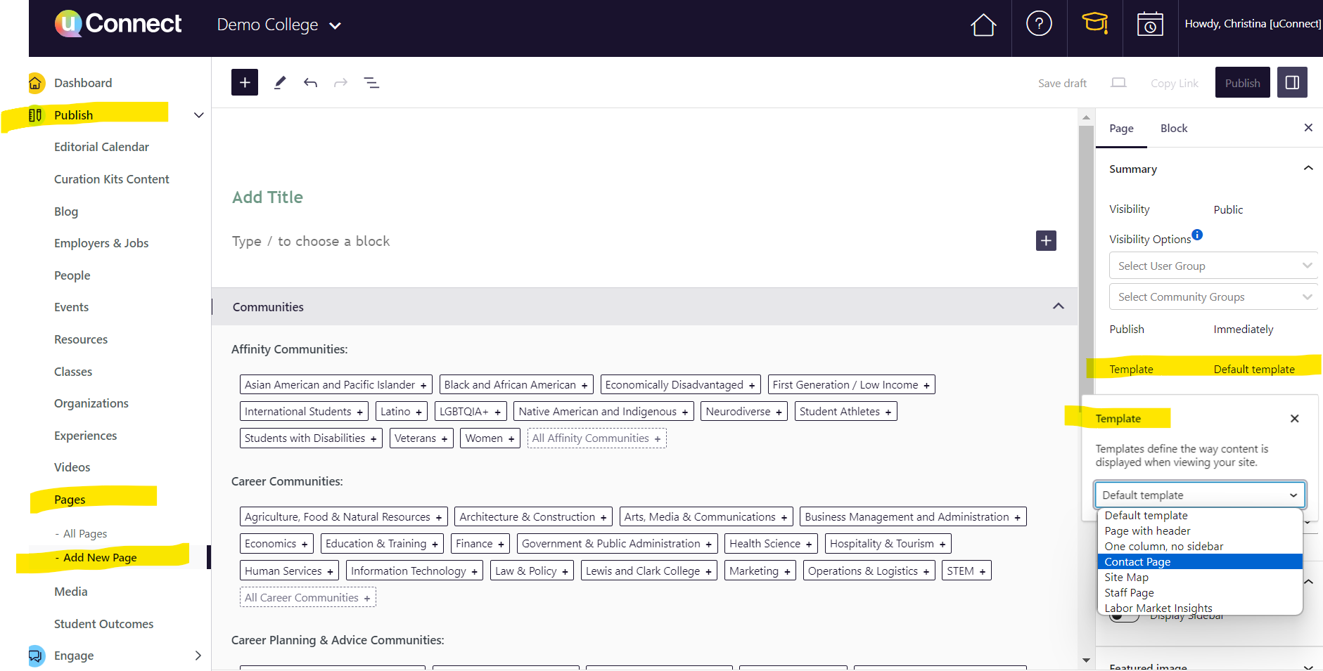
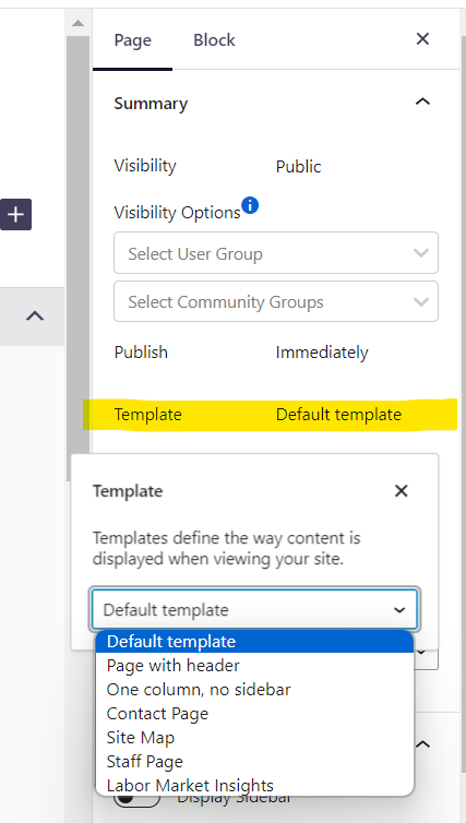
To choose a template, first, navigate to Publish>Pages, and then click "Add a New Page." Once you're on the new page, look to the right side: you'll see a Page Menu, and within the "Summary" section you'll see a subsection called "Template." Click on the word "Template" and a drop-down menu will appear, allowing you to select the template you are seeking:
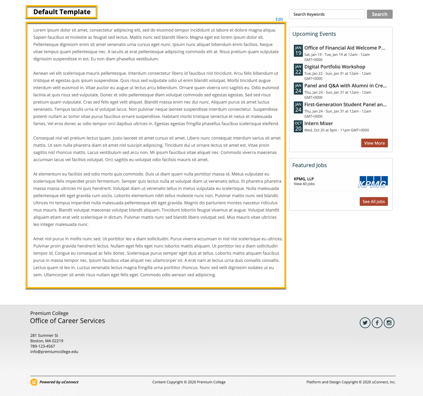
Default Template
When you create a page, it will always initially be assigned to the 'default template'. A page using the default template only has the two default fields included above (title + description) available to fill out.
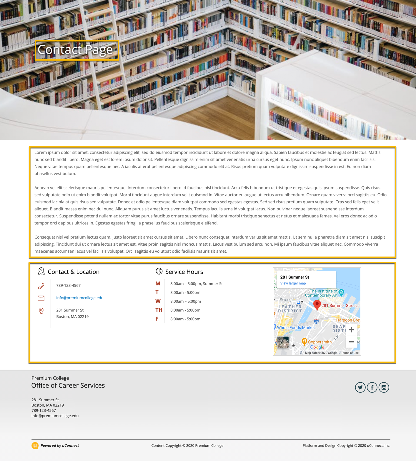
Contact Page
The contact page has three fields (in addition to title and description) associated with it that you can adjust:
Header Image: a full-width banner image across the top of the page (2100x700 px)
Display Title Over the Header Image: this allows you to set the page title to live over (on top of) the header image by selecting Yes, or, below the image, by selecting No.
Display Map: there are two built in widgets included on the Contact Page - the 'Contact + Location' widget, and the 'Service Hours' widget. This Display Map option allows you to include a third alongside them, with a map that intelligently pulls the location of the school. By selecting now, you remove it from the page. Note that the Contact + Location Service Hours widgets cannot be removed from this page.
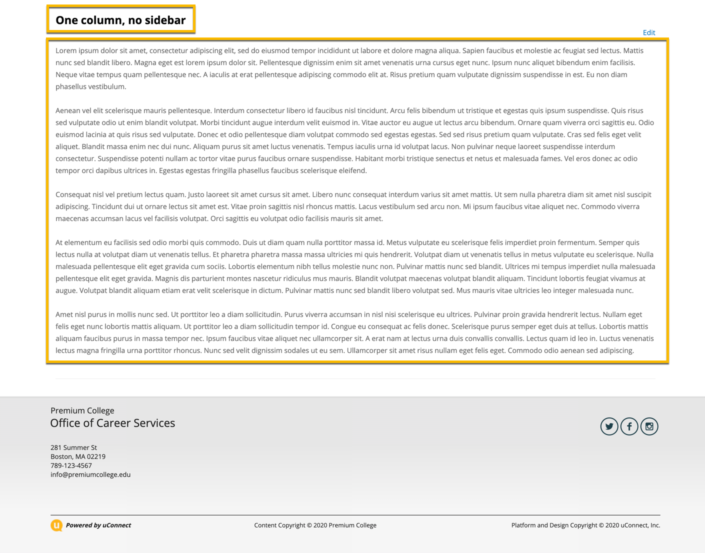
One column, no sidebar
This page template includes the same fields as the default template above (title and description) and no more. The difference here is that it removes the default sidebar widgets that you've identified for your platform.
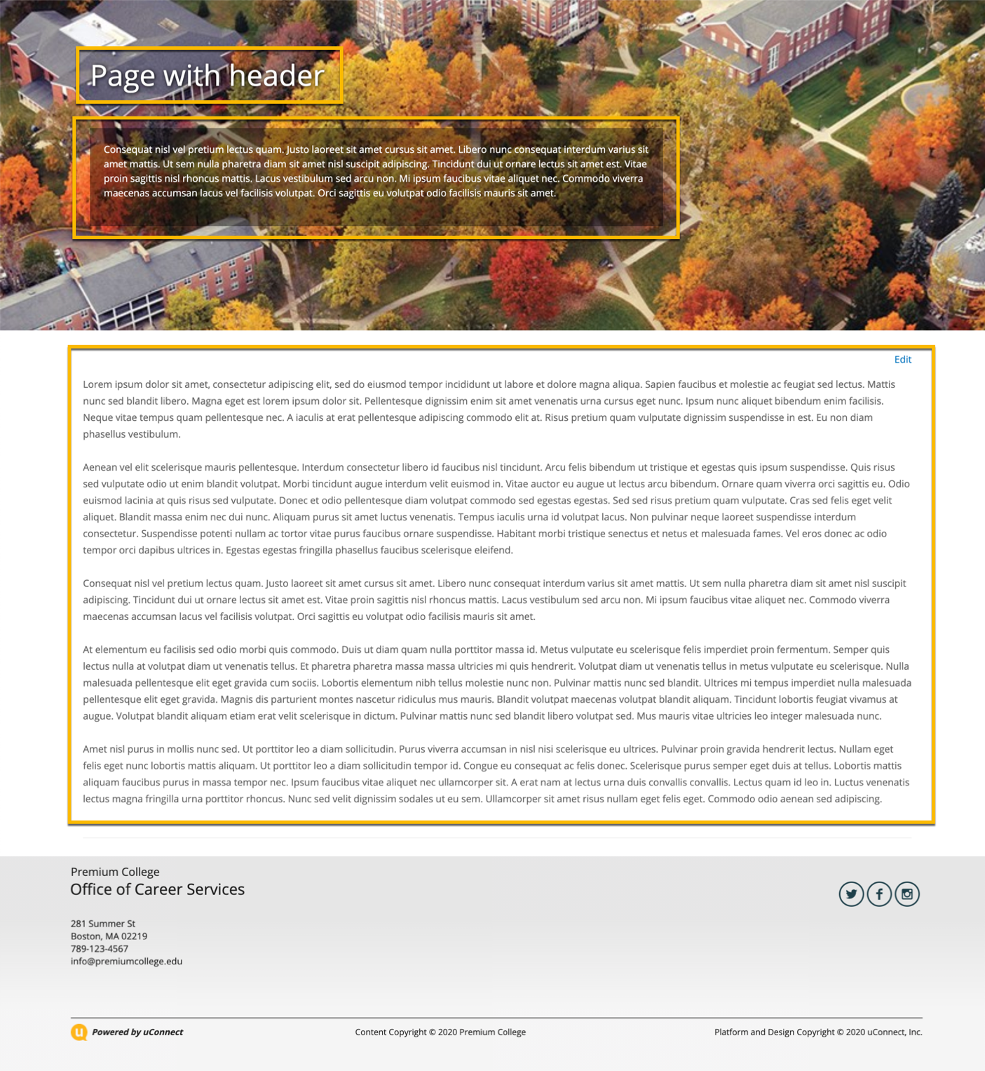
Page with header
This template includes many additional fields over the two default ones (title and description):
Display Sidebar: this determines whether you want your platform's default sidebar widgets to appear (like in the default template), or whether you'd like to remove them and have the content span the full width of the page (like the One column, no sidebar template)
Header Image: like the Contact Page, this allows you to include a full width header image (2100x700 px)
Header Title: if you leave this empty, the page title will be used as the title that appears when you land on this page. If you'd like to call it something different to users on the front-end, you can do so by adding in a new title
Title Alignment: you can determine whether you'd like the text to appear on the left, center, or right of the header image
Title Location: like the Contact Page, you can determine whether you'd like the title to appear over (on top of) or below the header image
Header Intro: you can include a short description that will appear on a gradient box over the header image, underneath the title.
Intro background opacity: you can determine how opaque / transparent you'd like the gradient box behind your Header Intro to be (only relevant if you have a header intro included.
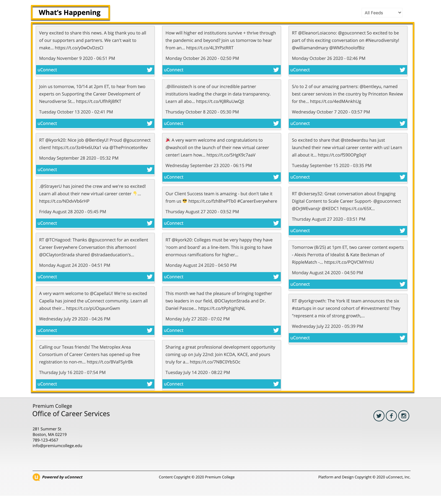
Social Page
The social page template does not include any additional fields over the title and description default fields. In fact, even if you include a title or description, they won't be included on the front-end page. Instead, this template intuitively creates a dynamic social feed based off the twitter account you've identified, includes no description, and is always titled 'What's Happening'.
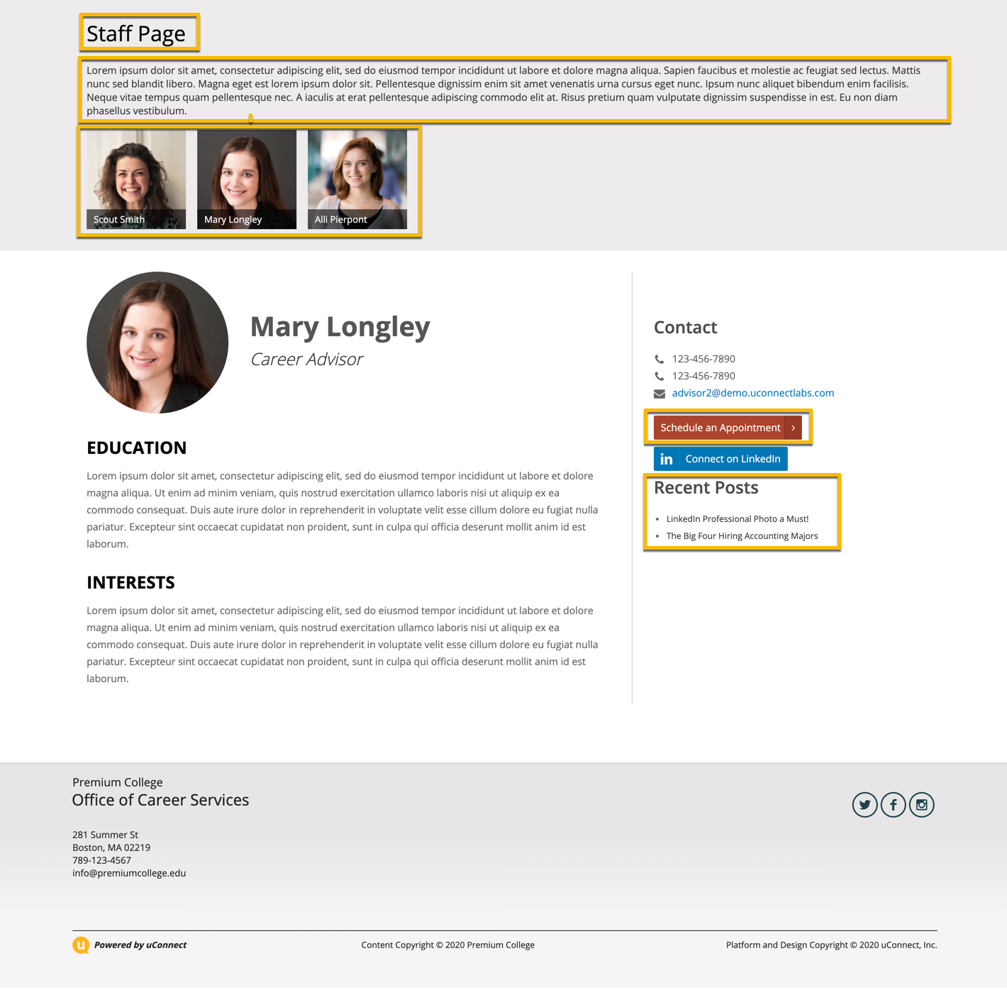
Staff Page
Lastly, we have the staff page! This page includes one extra feature unique to this template, in addition to the title and description.
All Users: use this keyword search to find the right staff members from a full list of users on your platform. Once the correct one you're looking for pops up, select them to add them to the left-hand list.
Live Staff Page Users: this list includes everyone you've selected from the All Users keyword search. Reorder the users in this list to determine how they appear on the front end page (top of the list appear on the left, bottom on the right).
Display Advising Categories: will display the advising categories associated with a user. Advising categories are adjusted in a user's individual profile.
Hide Recent Posts: by default, the recent blog posts a user has published will appear on their front-facing profile. Selecting this box will remove those from appearing
Appointment Button: allows you to set a standard text for the appointment buttons associated with each staff profile.
