Structuring your page content
When you're creating a page with a lot of content, follow these tips to make your page more effective.
Heading levels
Use the Heading block to add important section titles to your page. Headings are automatically styled to be larger than regular text; they may feature a different font or color, too.
Using headings correctly is essential for SEO and accessibility. Screen readers and search engines alike both value well-structured, semantic content, meaning that headings need to go in the correct order. Pages already start with an H1 title (the most important title, i.e. the page title), so your headings should begin at the H2 level – that's the default option with the Heading block. If you need to further break up your content underneath a H2 heading, you can use an H3 subheading, and any subheadings underneath that would be H4 headings. Once that section of information is complete, switch back to a H2 heading.
Think of your headings as a document outline to determine the correct level:
H1: Page title (already entered for you)
–– H2: Content heading
–––– H3: Subheading of the previous heading
–– H2: A different content heading
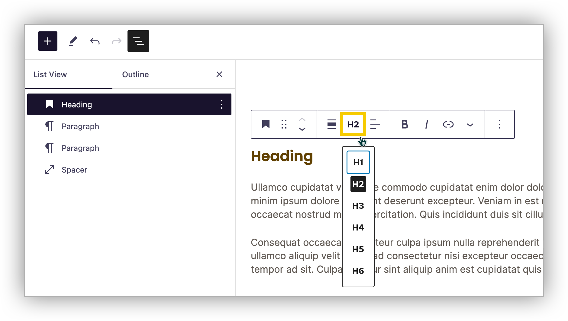
You can switch heading levels by selecting your Heading block, then choosing the correct level in the floating toolbar.

Don't use headings just for their visual style. Consider whether your content is actually a heading or just needs special formatting – remember, you can adjust font size, color, boldness, etc. directly in the Block Editor.
Make content skimmable
Using headings and visual breaks is a great way to help students scan your page and find what they are looking for. You can use visual cues to draw attention to key information or signal that content is part of a new section.
Avoid "walls of text", or paragraphs that seem to go on and on. Instead, split your content into multiple shorter, easier-to-read paragraphs or lists. Use headings when appropriate.
If your page is still looking dense, you can use the Spacer block to introduce a gap between sections. Alternatively, the margin and padding options on the Style tab can achieve a similar effect.
Of course, there are still times when you need to feature dense content that just can't be broken up – keep reading in the next section!
Layout tips for dense information
Collapse content with the Accordion block
The accordion block can be used to collapse and expand content. Use these thoughtfully, as every opened accordion "costs" a click. If users have to click too many times, they may become frustrated. Accordions are best for content that doesn't all need to be expanded, such as frequently-asked questions or additional information that may only be relevant to a specific group.
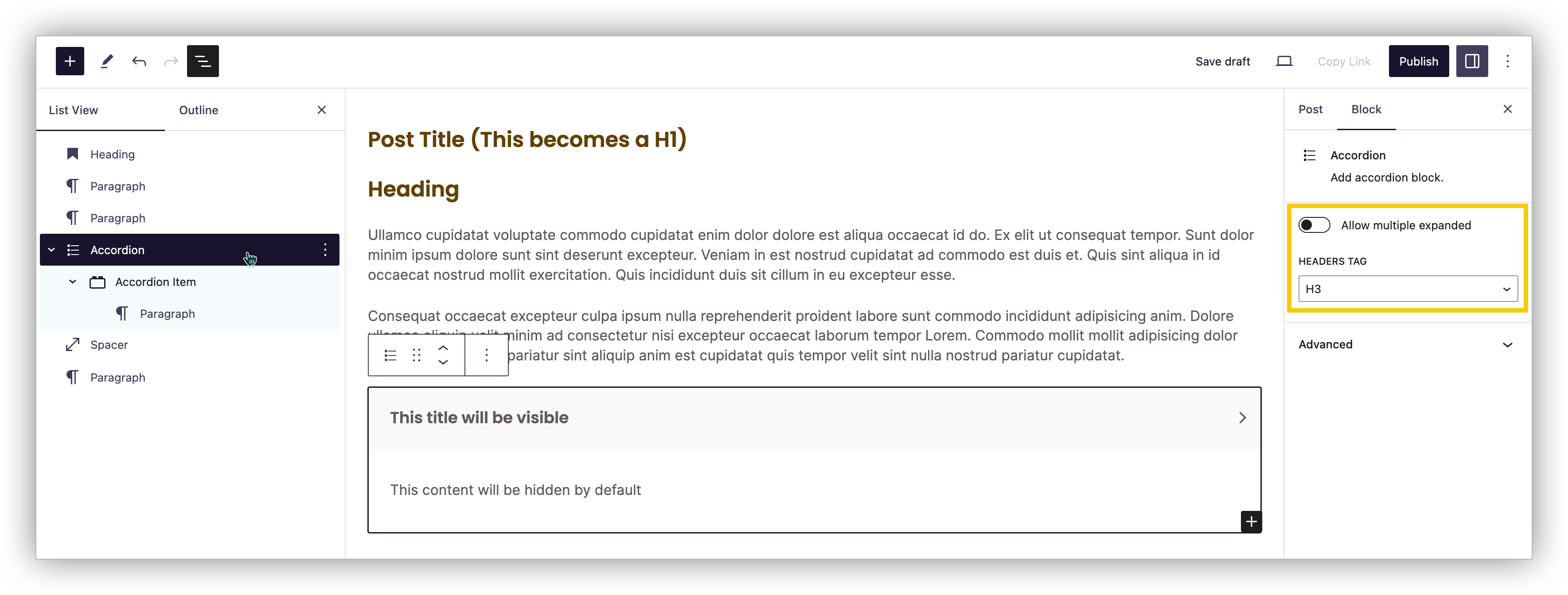
When you select the Accordion or Accordion Item block, you have the option to change the heading tag used for your accordion. Make sure to follow the correct order based on its placement on your page.

Organize content with the Columns block
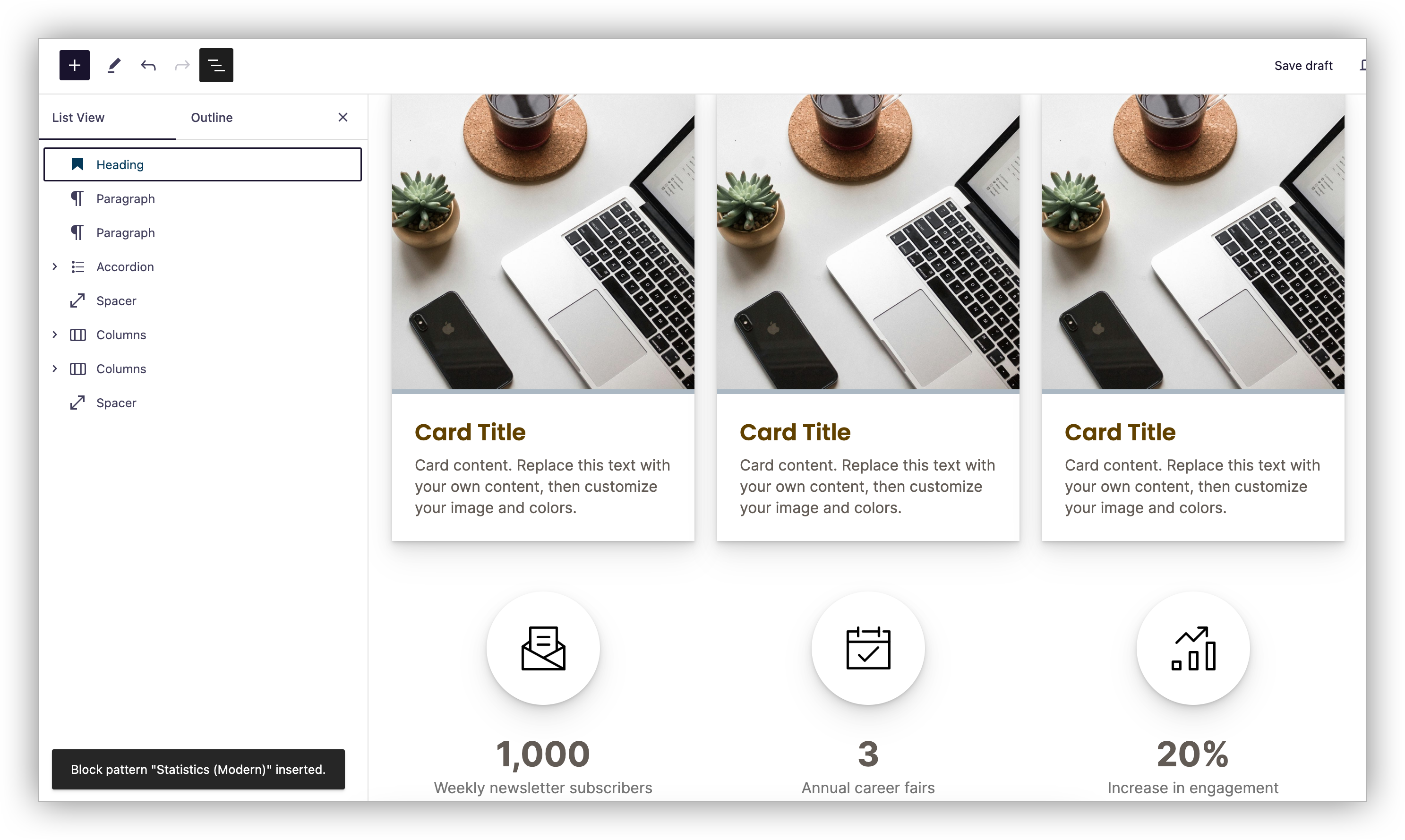
Using columns can help you create a predictable rhythm on your page. Users can quickly skim their headings, then read on for the relevant information. Columns are recommended when you have sets of similar information, such as majors within a program or highlighted statistics. Use a similar structure in each column for repetition or mix things up to create a more dynamic layout.
Pair your Columns with other rich-formatting blocks like Images to create something eye-catching and engaging! If you'd like to try either of the designs in the screenshot below, they are available in our Pattern library.

Add anchor links
Anchor links (or "jump links") can link to a specific location within the page so that users can jump straight to the content they want to see. You can use buttons or regular text to link to different sections of your page. Mix and match: insert a row of buttons for in-page navigation at the top of your page, then use links within paragraphs to point users to the right place.
Don't be afraid of scrolling
There's a myth that users don't scroll. It's true that the top of the page is the most important, but usability experts from Nielsen Norman Group "always said that people will scroll if they have a reason to do it." Focus on creating quality content in order to keep users reading.
Trying to cram too much information into a small space full of accordions, columns, etc. just to reduce scrolling can actually make your page feel denser and more overwhelming. Headings, gaps (Spacer block), and images can help for skimmability.
All that said, if your page is trying to do too much, consider restructuring your content. Pages are free; you can always create another and link to it!