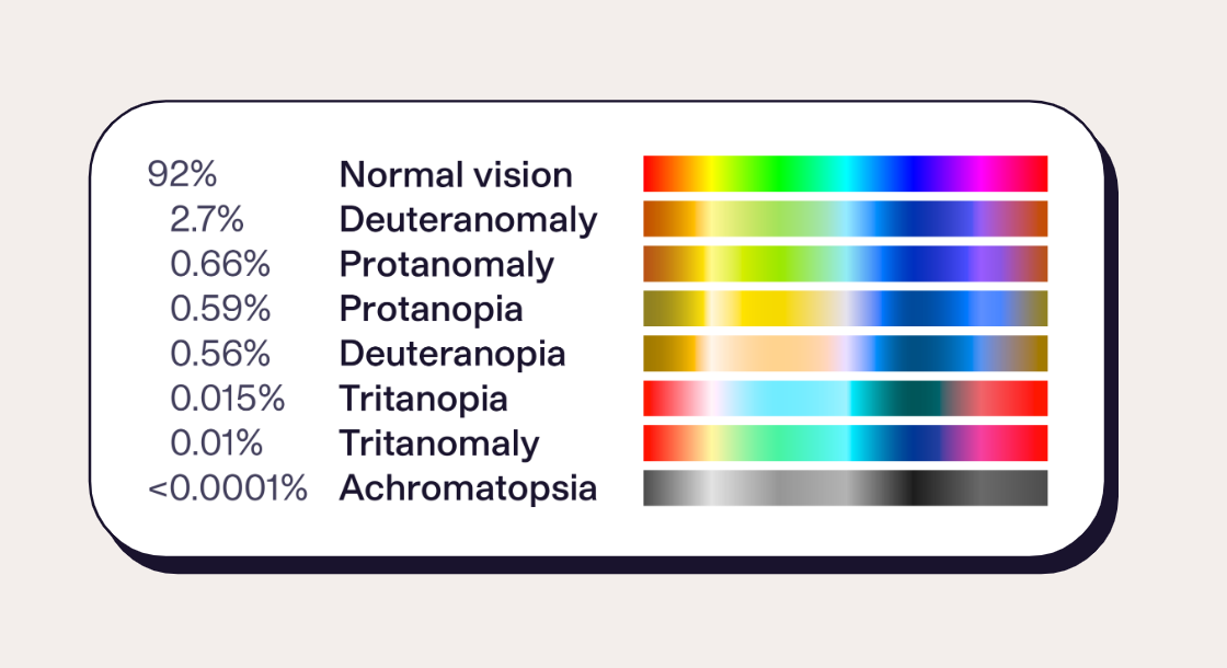
Did you know that 8.73% of people experience some form of color vision deficiency? According to X-Rite, 1 in 255 women and 1 in 12 men are affected. Red/green color blindness (deuteranomaly) is most common.
via Wikipedia, “Color Blindness”
How’s your hue IQ? Try the X-Rite Color Challenge and Hue Test to see how your color vision compares.
Even beyond color blindness, other factors affect our vision and understanding of color:
-
Lighting conditions (sunny day, dark mode)
-
Colors in our environment
-
Fatigue, eye strain, and other physical barriers
Since it's not safe to assume that everyone experiences color the same way, we can't use color as the only differentiator between e.g. a "good" and "bad" state. If we only used green and red for those conditions, users with deuteranomaly would not be able to easily differentiate one from the other. We can combat this by adding another cue, such as a check mark or warning icon to indicate states.
That's not to say that you need to avoid color! Just make sure that it isn't the only cue. Imagine looking at your page in grayscale: would the right content still stand out? Is your content easy to scan?
Use enough color contrast
Color contrast guidelines
The accessibility guidelines for color contrast depend on the level of compliance. uConnect uses AA-level compliance, with for 4.5:1 contrast for all general text.
|
Element |
AA Ratio |
AAA Ratio |
|
General text |
4.5:1 |
7:1 |
|
Bold small text 14pt and larger (18.6px) |
3:1 |
4.5:1 |
|
Large text 18pt and larger (24px) |
3:1 |
4.5:1 |
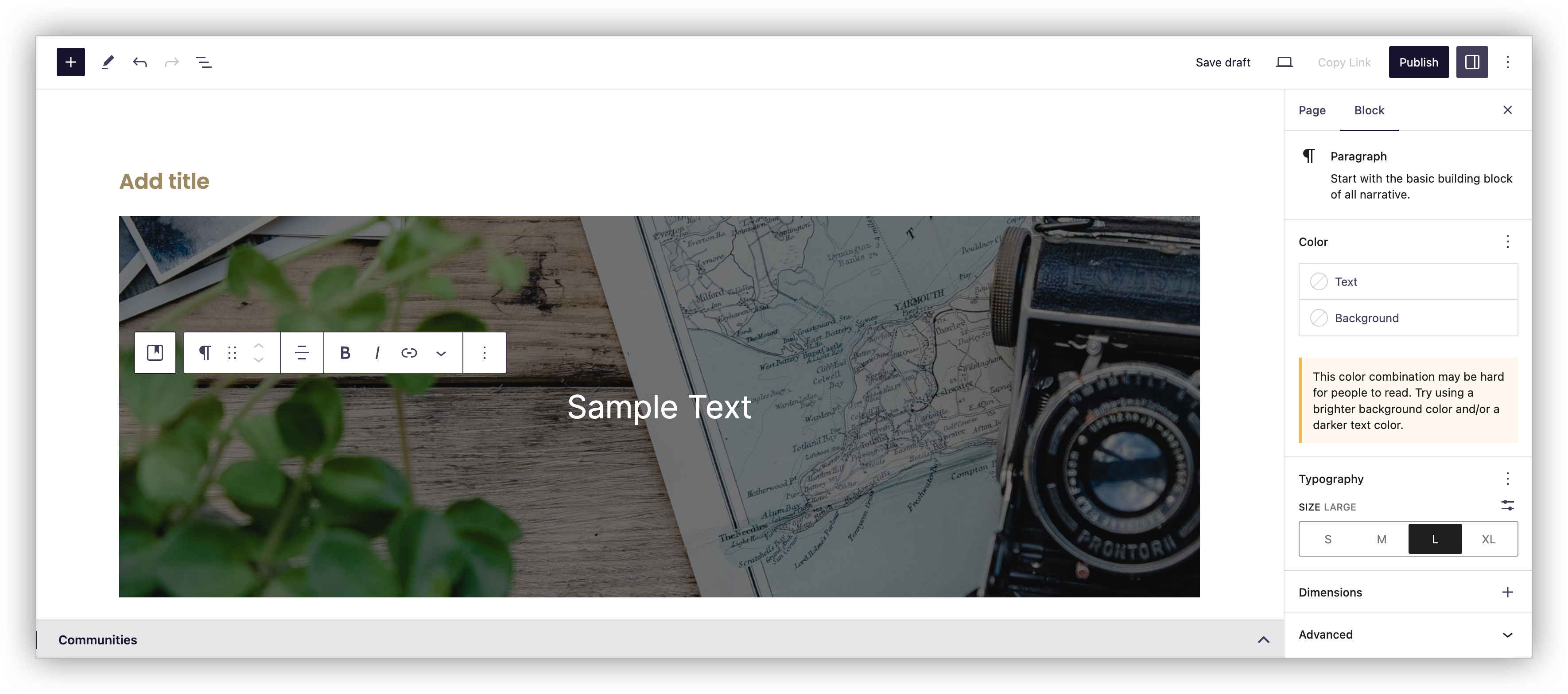
Measuring color contrast in the Block Editor
The Block Editor will do its best to warn you when there isn’t enough contrast between the text and background; simply click on a text element and look in the block sidebar underneath the Color heading.
However, this is less reliable with text against image backgrounds. This example has adequate contrast, but the automatic color contrast checker is not able to sense the darkness of the background. You can use the Cover block to automatically darken a background image, then adjust its Overlay color and opacity for further customization.
Manually checking color contrast
When choosing colors in other areas (or just to double-check), use a tool to measure contrast, such as: