Update and streamline your Resources
Revamp your resources library with these easy design tricks to encourage student engagement drive more traffic to your valuable resources.
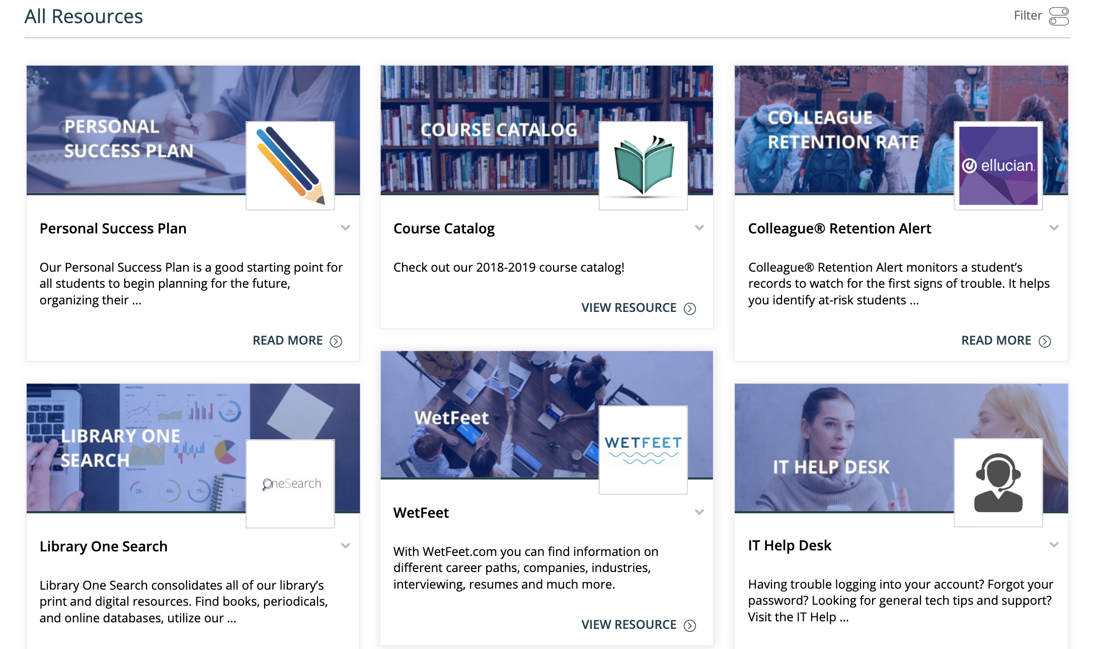
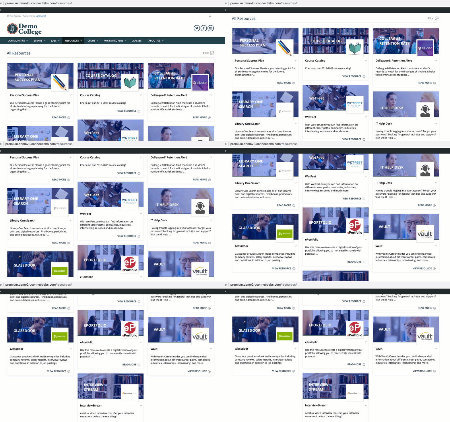
Check out our sample resource library below:

Creating a streamlined design plan across the page can make your site look more polished and inviting. It also sets expectations for students that are interested in reading your content and using these resources.
Presentation is key - it sets the tone for your user interactions and promotes a sense of professionalism across your platform.
Now, we'll tackle exactly how you can implement this strategy yourself.
Create streamlined featured images
Try creating featured images on Apple's user-friendly app, Sketch, or on Adobe InDesign, Photoshop, or Illustrator.
Looking for a free design version? Try out the super-user-friendly Canva, which you can use to create numerous design files, all without the cost of complexity of the big name design tools!
Designing a professional looking thumbnail is as easy as downloading a stock photo from the internet (e.g. from pexels.com), creating a colored overlay with a low opacity, then inserting text over the image.

In looking at the above example, you can see that they've used their institutional brand to drive the theme of their resource library. All images are given a color overlay within their brand, and use fonts approved by the marketing department!
Keeping on theme with your institutional brand is key to creating a uniform user experience, and establishing credibility in your resources.
Verify that all of your featured images have a high resolution
Another easy way to clean up your page's look is to keep an eye on pixel size as you pick a featured image for each resource. We recommend that you choose an image with the following ratio: 480x320px (1.5:1). Photos that don't meet these dimensions will appear skewed or cropped.
It's also important to choose images that have high resolutions. Don't limit yourself to images with a 480x320 pixels -- the higher the count, the better the resolution, and the more put together your resources appear!
Selecting photos with these size guides in mind will prevent your images from appearing blurry, pixelated, or outdated.