Below are the key areas where customizations can be made.
NOTE: While uConnect may look like a website, some elements cannot be changed to exactly match your institutional website branding, but we will do our best to match as closely as possible.
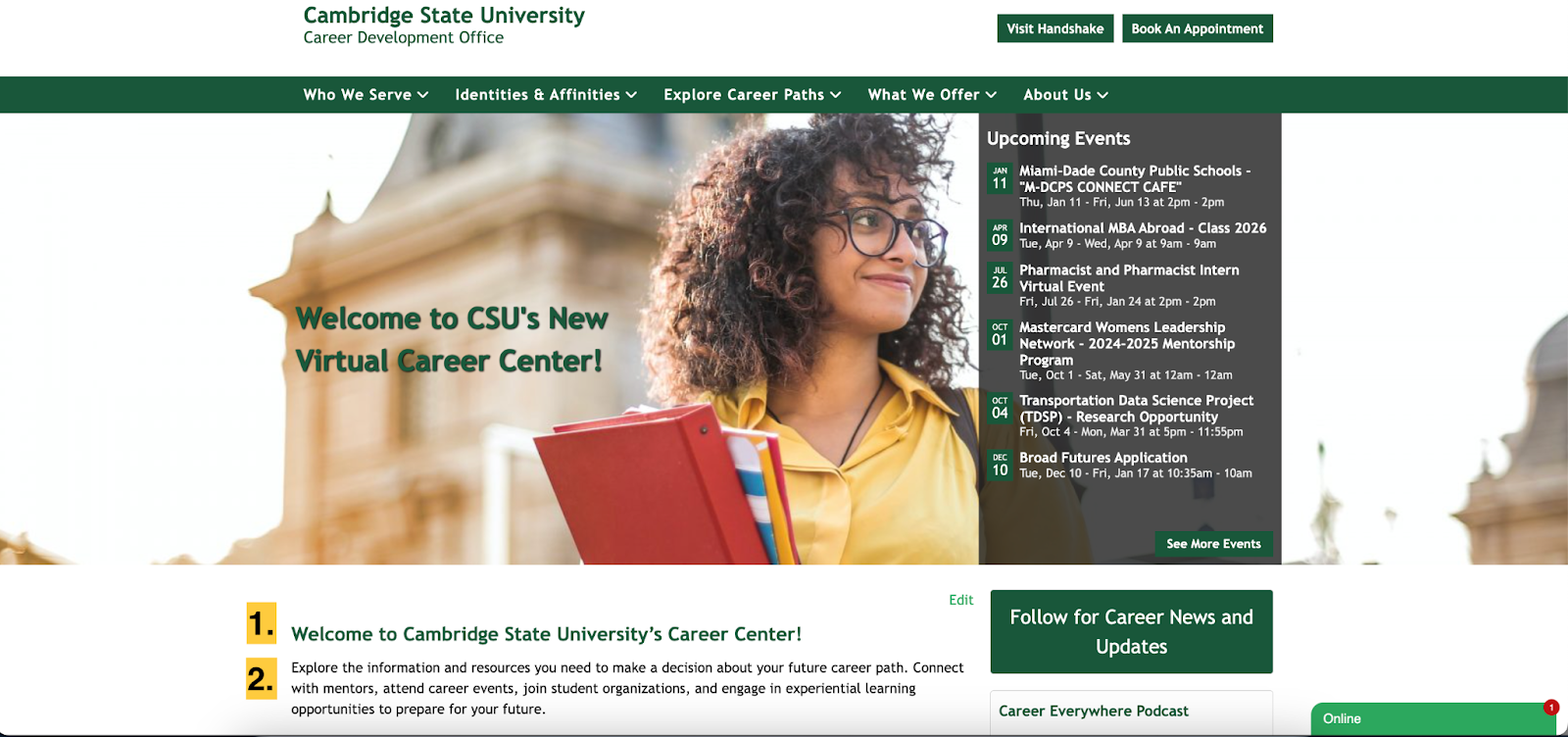
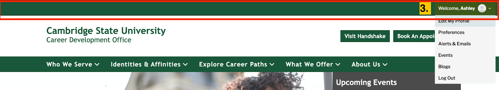
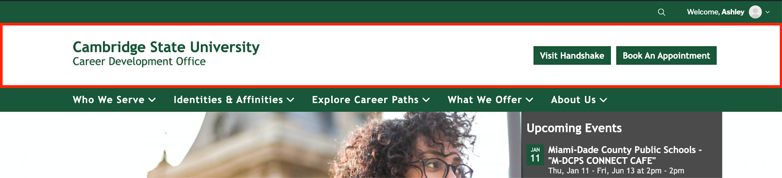
Top Ribbon
The top ribbon is the thin, top navigation bar on your uConnect platform.
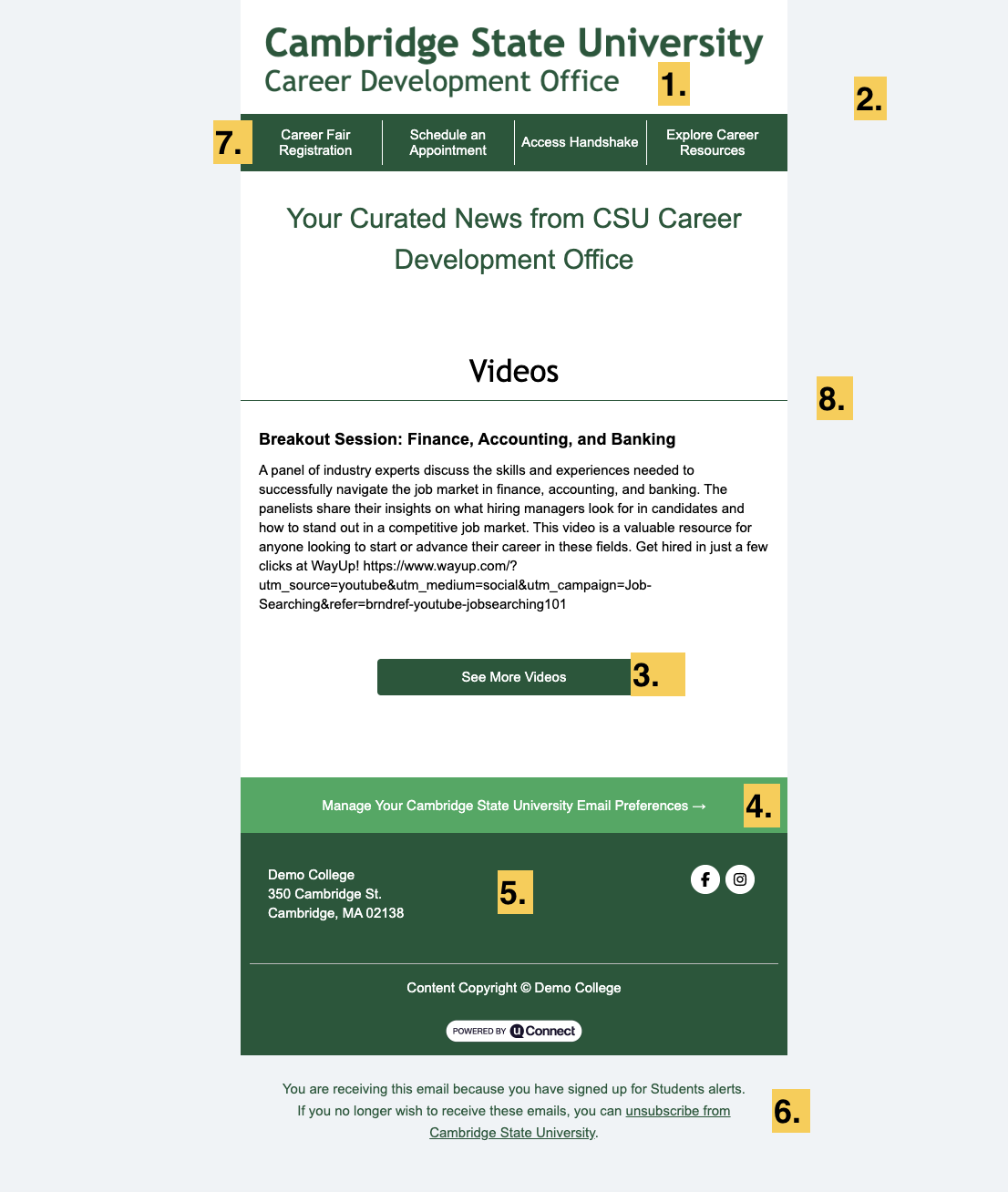
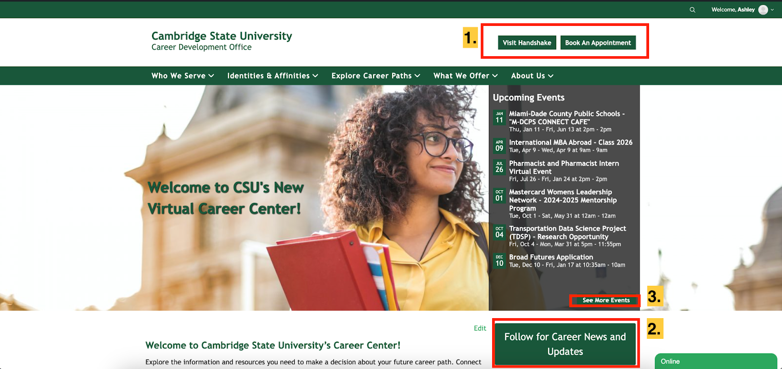
This is the space found between the top ribbon and the main navigation. It typically holds your institutional logo and call-to-action buttons
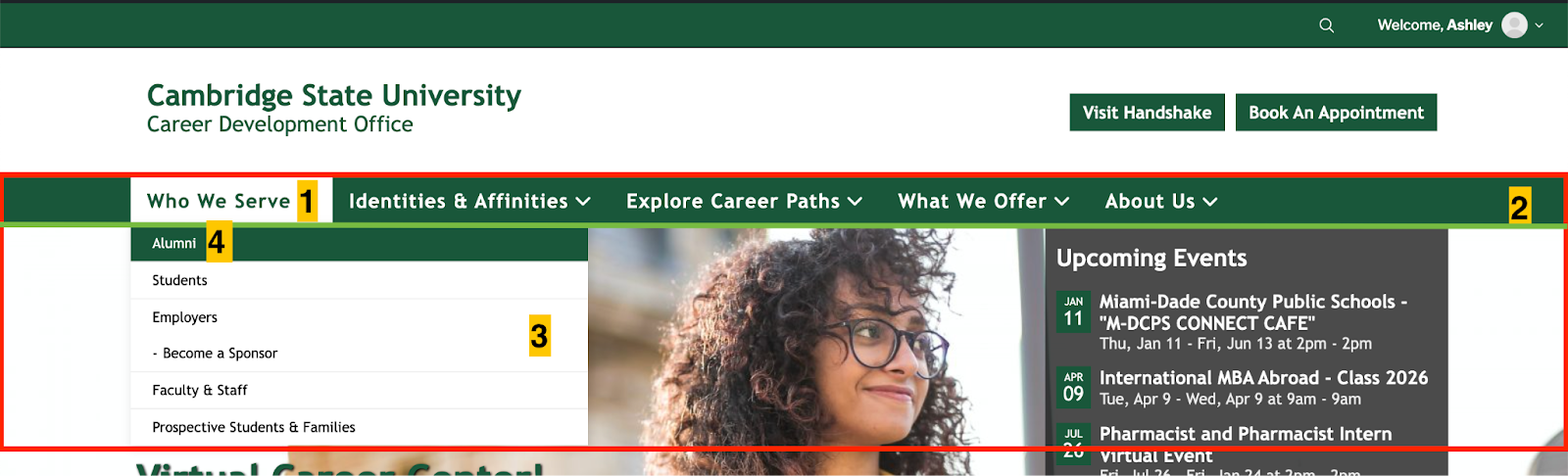
This is the space found between below the header space and holds your main navigation.
Note: We only support horizontal menu layouts at this time.
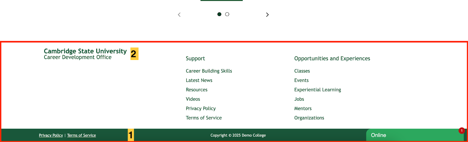
This is the footer of your platform and can be viewed on all pages on your uConnect platform.
Note: You’re able to adjust the contact information, social media icons, and footer menus under Customize in the backend of the platform.
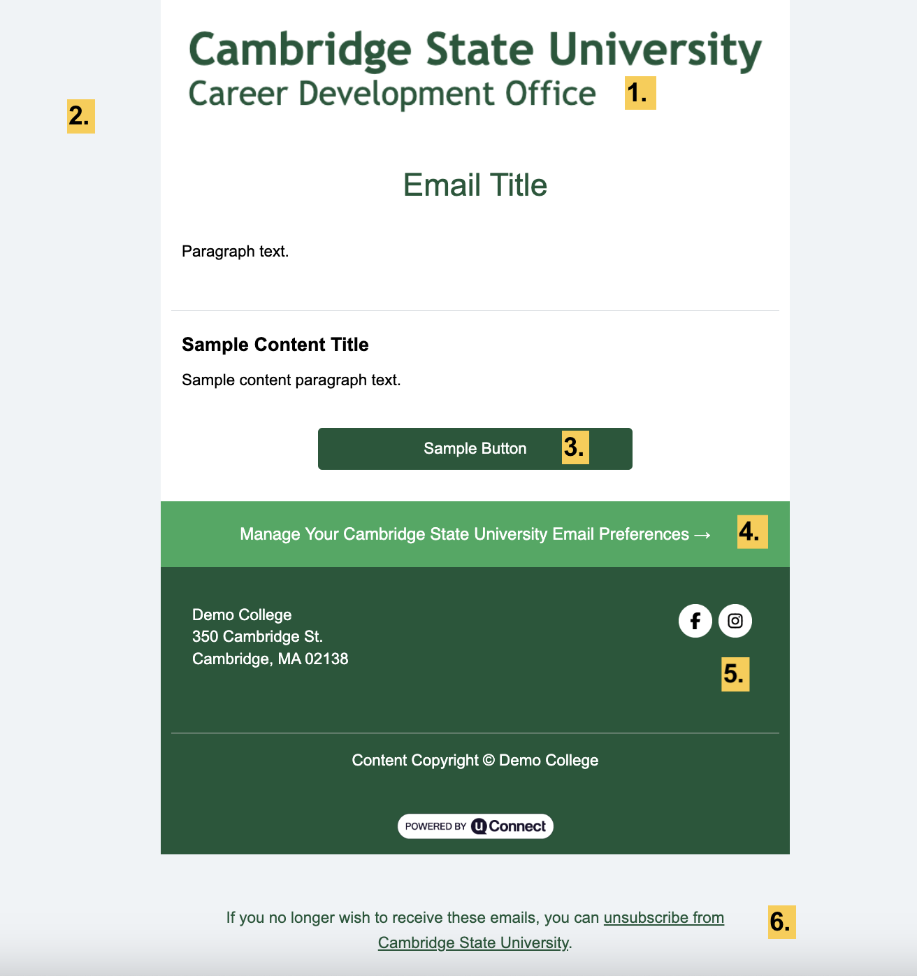
uConnect can send branded emails under Engage in the backend of the platform.
NOTE: We cannot customize branding separately for custom emails versus automated alert digests. Branding will appear the same for both.
These are call-to-action buttons across the platform. They exist:
-
In the header space
-
As a button side widget
-
Call to action to view more content or open content from a preview.
These are the fonts to brand your platform. uConnect supports Google Fonts and custom font uploads in WOFF and WOFF2 formats.
There are different font styles and font-weight for every font. Choose the one that you think will be used on the website. Usually, a regular, regular italic, and bold font style is needed.
Generally, we look for a 400 (normal or regular, also called “book”) weight and a 700 (bold) weight. We also recommend an italic version of the 400 weight.

These are the default colors that are used to brand your platform.
Note: Colors and color combinations may need to be adjusted for accessibility reasons.