Customize your menu icons, text size, layout, and more!
Looking to customize your menu items just a bit further? While, by default, your menus will be branded to match your institutional branding and web accessibility standards, there are a few additional options that you will have, as detailed below. Remember, to update your menus, you will need to be in the Customize > Menus area of your dashboard, and you will need to select the given menu that you would like to make changes to from the menu dropdown!
Important! You MUST make sure you have the "CSS Classes" checkbox selected under "Screen Options" in the top right corner so that you can view this option when editing your menus.

Hero Navigations
Hero navigations are menus that appear underneath the header image on a page. A hero navigation can appear on your front page and / or on your Communities. There are specific options that you have available to customize your hero navigation menus, although please note that, by default, your hero navigation will be set to match both your institutional branding and web accessibility standards. It is recommended that you consider these branding and accessibility standards prior to any changes that you make.
Adding Icons:
To add an icon to appear within a given item in a hero navigation menu, you will need to select an individual menu item and then select an icon from the 'Menu Item Icon' dropdown list of options.
If you select the 'Only Show Icon' option that appears below 'Menu Item Icon' your text will be hidden in the menu item.
To remove menu icons, you will need to select the 'No Icon' option from the 'Menu Item Icon' dropdown.
Changing the Background Color:
To change the background color of your hero navigation menu, you will need to individually select into each menu item and override the default color setting.
To do so, expand each menu item in the given hero navigation menu. In the CSS Classes field, you will need to input the following:bg-color-inserthexcodehere. Where we haveinserthexcodehereyou will want to insert the corresponding hex code for the color that you are intending to change the menu item too.
Example:bg-color-369896
Changing the Text Size:
To change the text size, you will need to individually select into each menu item and override the default text size.
To do so, expand each menu item in the given hero navigation menu. In the CSS Classes field, you will need to inputtext-size-insertnumberhere. Where we haveinsertnumberhereyou should input your desired font size.
Example:text-size-20
Changing the Text Color:
To change the text color, you will need to individually select into each menu item and override the default text color.
To do so, expand each menu item in the given hero navigation menu. In the CSS Classes field, you will need to inputtext-color-insertcolorhexcodehere. Where we haveinsertcolorhexcodehereyou should input your the hex code for your desired font color.
Example:text-color-ffffff
Tip: If you are not sure where to find the hex code for a particular color, we recommend downloading a browser extension like Color Picker that will allow you to find the hex code for any color on a webpage. You can also consult your institution's branding guide that will contain hex codes for your official institutional colors.
Primary Navigation
Your primary navigation is your main menu that appears at the top of the web page across every area of your platform. Because of the importance that this menu plays in making your platform accessible, there are a multitude of default settings that our team will have already put into place to ensure that your primary menu matches both web accessibility standards and your institutional branding.
Beyond those settings, there are two customization options that are detailed below:
Column Layout:
Adding a column layout to your primary navigation allows you to have up to three columns of menu items beneath a given main menu item.
-2.png)
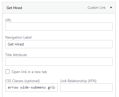
To add this, on the main menu item, in this case 'People We Serve,' you will need to add the following code in the 'CSS Classes' field: arrow wide-submenu grid-submenu.
Then, you will need to rearrange the menu items that fall beneath that main menu item into your, up to three, columns.
Tabbed Layout:
Adding a tabbed layout to your primary navigation allows you to have tabbed sub-menus within a main menu item. As seen in the screenshot below, a user would have to hover over each tab individually to see the items within it.
-2.png)
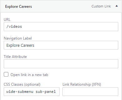
To add this, on the main menu item, in this case 'People We Serve,' you will need to add the following code in the 'CSS Classes' field: wide-submenu sub-panel.
Then, you will need to rearrange the menu items that fall beneath that main menu item into your tabs.
Please note, that some users may find it challenging to navigate between the tabs and that we advise using the column layout above.